By Eric Leuenberger
 Navigation menus are an essential part of ecommerce site design. For navigation to contribute positively to the overall enterprise, it must first and foremost be usable to the customer. Usable means that the menu is divided into logical top level and sub level categories, which enable customers to quickly and easily find what they are looking for in as few clicks as possible. Another important consideration is the technology utilized to develop the menu system, as it must make the navigation accessible to as many users as possible.
We will focus here on the Mega Menu, a concept first introduced in 2006 by Amazon.com as a way to salvage the company’s tabbed structure, due to the size of its offerings. Since then, the concept has become a design standard with ecommerce companies of all sizes. In the case of the Mega Menu, opting for a pure CSS driven system vs. a JavaScript driven system will provide more accessibility to users, with or without JavaScript turned on. But not all Mega Menus are created equal.
Mega Menus done right
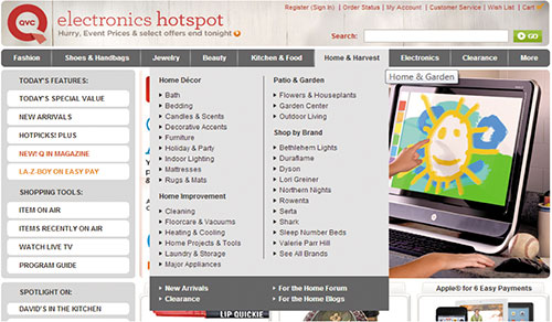
Good Mega Menu design consists of multi-dimensional panels divided into logical groups of navigation options. Headings hold together each group and provide the user with a means of understanding the composition of each unit. In the example below, the Home & Harvest top level menu item is broken down into logical subcategories of Home Décor, Home Improvement, Patio & Garden, and Shop by Brand. Within each of these subcategories there are further refinement options that have taken into consideration store offerings, as well as customer search habits and product usage.

Mega Menus done wrong
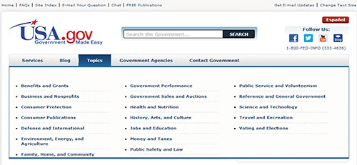
Just having a Mega Menu on a site is not enough, and if implemented incorrectly, it can actually hurt more than help. Consider the following example.

The layout of this Mega Menu makes it difficult for users to find what they are looking for. Rather than putting links under logically grouped headings, they are scattered on the page in a top to bottom alphabetical manner. Even that may not be apparent to the average user at first glance. Before they can navigate, they must scan every link. It would make more sense to include links under headings of various topics such as “Business Resources,” “Consumer Resources,” “Government Resources,” etc. This would enable users to quickly locate the group of links that fits their needs, and to navigate quickly to that section of the site. Without that segmentation, one cannot know whether the link titled “Jobs and Education” directs them to a section of the site targeting consumer, business or government. This results in a guessing game that not only hurts usability, but can make for some unhappy site visitors.
Technical considerations
Be aware of the technical roadblocks that may be present when choosing Mega Menu systems. Many Mega Menu solutions require jQuery to operate. While this gets the job done, it does limit those who can use the navigation to visitors who have JavaScript active in their browser. True, only a small percentage of Internet users do not have JavaScript enabled on their browsers. However, if given the choice, it is best to build the menu with all users in mind. An alternative is to use a pure CSS driven approach, which does not require any special needs on the part of the end users.
Mega Menus can enhance the usability of a website’s navigation, but, as demonstrated above, this is only the case when the menu itself is planned and designed in a logical manner, and uses technology that does not limit visitors to its operation. Before any pen is lifted or any pixel is drawn, take the time to plan website design and technology to ensure maximum benefit from its navigational structure. Mega Menu or not, nothing can overcome poor design.
