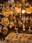
 While incorporating lighting displays in a booth is hardly new, at ASD, the lighting this year was impressive, drawing attention from thousands of attendees. From LED merchandise to in-house halogens, the lighting strategies at this year’s show were noticeably well executed. Bearing this in mind, there are a few key tips retailers can take away from ASD exhibitors and use to help products look their best at a brick and mortar store.
One of the most obvious lighting trends this year was the use of color. Some exhibitors opted to incorporate colorful signs outlined in LED light string, while others decorated the edges of tables and shelves with colored light ropes that coordinated with the company’s branding materials. By defining the edges of booth spaces with such eye-catching displays, wholesalers made sure that browsers’ gazes landed on their merchandise and not on that of competitors with dimmer arrangements. Retailers can easily adapt this tactic in their own businesses by looking for places where lights would work well, and where an outlet is available. Even a strand of rope lights around a sign can make an establishment more noticeable and easy to remember.
Throughout the Las Vegas Convention Center, there was an unmistakable shift in enthusiasm when attendees passed from the south hall to the central hall. While some of that excitement may be attributed to the fact that the central hall contained jewelry and accessories, what really impacted the overall look and feel of the central hall was the lighting. Exhibitors with bedazzled, polished and embellished wares highlighted their spaces by using gallery bulbs, track lighting and warmer toned lights that made the merchandise appear more luxurious. By going for more flattering lights such as these, as opposed to relying solely on the permanent overhead lighting of the Convention Center, sellers at the show made their spaces feel more inviting and attracted more buyers as a result. Retailers can achieve the same effect by paying attention to the tones of lights used to showcase products. Note that a slightly pink light will make skin and any accessories or apparel being worn, look fresh and vibrant, whereas a more yellow light will make furniture, bedding and housewares look cozy. By shedding the right light on merchandise, retailers can entice more customers to stop and look around, the first step in getting sales.
Don’t miss ASD New York, September 9-11, at the Jacob Javits Center.
