By Amanda McCreary
 2014 was a year of ups and downs for ecommerce, with a general trend towards improving the customer experience, making websites more agile, and making content more available for consumption. We found some brands that flourished, but others that struggled to keep up, with hard-to-navigate, antiquated sites.
Below is a list of the best and worst user experiences on the web in 2014.
Top 5 Best of Breed
1. Anthropologie has a gorgeous website, with an effortless commerce experience. Their brand is incredibly well developed — they know their customer well, but themselves better. Anthropologie’s fantastic Omni channel approach makes the shopping environment seamless whether in-store or online. The site is beautiful; the shoppable lookbook is visually stunning and makes shopping straight from their content easy.
2. The Skullcandy website is a visual overload — in the best way. The site conveys how clear, loud, and awesome their headphones and other products are. Every page has stimulating graphic content, free audio downloads, and new artist features, making you hungry for more. It is a prime example of stellar content and commerce integration, clearly defining the brand through every experience on-site. The product pages feature responsive design with video, informative scroll-over content, and beautiful product pictures.
 3. Abercrombie and Fitch has a more “traditional” commerce site structure, with clean lines and a modern look, but their homepage is spectacular, and their content integration is fantastic. The company built a beautiful, interactive experience, allowing customers to browse and shop from the same page without ever navigating away. There’s also Wanelo integration – a trend we have started to see across commerce sites. This integration gives Abercrombie a chance to interact with their prime target audience through a popular social sales channel.
4. Lush has a unique online experience that is not just about commerce, but also content. Lush expertly took its in-store experience, and recreated it online through an interactive and engaging website. The site structure is unlike any other, with big, bold blocks of content, and the ability to buy items right from the homepage. The line frequently found between browsing and buying simply does not exist here, and it feels like a peek into the future of online commerce.
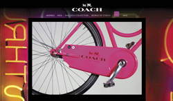
 5. The Coach website draws you in with a full-screen, seasonal video on the landing page, setting the tone for the whole site browsing experience. The brand story is present throughout every page — especially the product pages, where Coach tells the story of their quality and craftsmanship. The site is simple to navigate, and offers a cohesive experience across content and commerce.
5 Missed Opportunities
1. Brooks Brothers has a deep history and a unique vision. In their physical stores, they do a great job telling their story, but online the brand is completely lost. The site is very much designed for commerce, but there is little thought put into maintaining the brand experience from store to site. Engaging content is virtually nonexistent, which means users are not getting a story along with their shopping experience. This results in a brand that feels particularly one-dimensional, when the reality is that this brand has many dimensions: they are just not coming through in a powerful way.
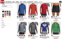
 2. Under Armour is a well-known brand, with lots of enthusiasm for its products. They recently made headlines by partnering with star ballerina Misty Copeland, in addition to working with other popular athletes. However, when you browse their commerce site, none of those stories come through, and there is no opportunity for fans and customers to engage online. Giving customers the opportunity to really immerse themselves in and interact with those stories would make for a much more powerful and impactful experience.
3. Kay Jewelers is a classic example of a commerce site stuck in the past. The layout and graphics are a bit outdated and the site is predominantly static, making for a displeasing browsing experience. Kay is practically a household name at this point, with a warm, full-hearted feel that is clearly represented in store and through television commercials. But the website shows nothing of its ‘Every kiss begins with Kay’ tagline, and the associated smiling faces. They have a story to tell, it is just not being told online.
4. Brookstone is known for its innovative, outside-the-box consumer products. At any Brookstone store location, you can play with their signature sand, sit in a massaging chair, or test out a memory foam pillow. But online, all you see is a static site that is hard to navigate. They have so many products and so much information to share, but they way its presented online makes it feel overwhelming. Where is the engagement we have come to know and love?
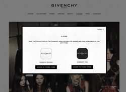
 5. Givenchy sells a luxury product, which should be accompanied by a luxury experience. Its website graphically is very in line with their brand, and does a great job showing off what they are all about. But when you click through to the “E-Store” tab, you cannot actually shop their site! They offer their products only through apps for iPhone or iPad, which means they are losing out on a major sales channel.
So what does it all mean?
Commerce is changing, and much for the better. But brands need to make sure that their story comes through across all channels. Maintaining a cohesive message across every customer touch point is a crucial step towards improving the customer experience, and ultimately increasing sales.
 Amanda McCreary is the Senior Product Marketing Manager of Commerce at Acquia, a digital experience company which helps more than 4,000 organizations including Pinterest, Mercedes Benz, and Warner Music Group transform their digital businesses.