by Melissa Stivale
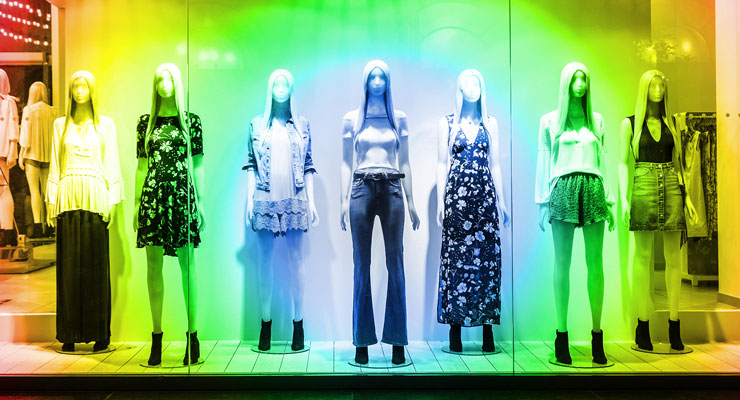
While we do not often stop to think about how much color affects our daily lives, its influence is something marketing professionals can and should use to their advantage when it comes to branding and visual merchandising. The proper use of color theory in window displays has the power to increase foot traffic by eliciting emotion, demanding attention, conveying messages, and expressing personality.
What is Color Theory?
To understand color theory, it is important to first have a grasp on the color wheel. Invented by Sir Isaac Newton all the way back in 1666, the color wheel is a visual representation of colors strategically arranged in a circle. It consists of 12 colors that fall into three categories:
- Primary: cannot be made from mixing others (red, yellow, blue)
- Secondary: made by mixing two primary colors (orange, purple, green)
- Tertiary: made by mixing primary and secondary colors (vermillion, magenta, violet, teal, chartreuse, amber)
Color theory uses the wheel to determine relationships between colors and helps everyone from artists to marketers create combinations that perfectly complement each other for the best visual appeal. Mixing and matching colors in certain ways has the power to completely alter the message you want to convey. There are a handful of tried-and-true combinations such as these:
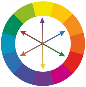
- Complementary: consists of two colors from opposite sides of the wheel
- Monochromatic: consists of different shades of the same base color (like pastel-blue, neon-blue, and navy)
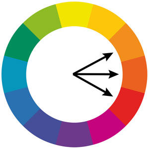
- Analogous: consists of a trio of colors positioned next to each other on the wheel
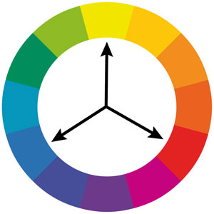
- Triadic: consists of three colors equally spaced out on the wheel
- Tetradic: consists of four colors equally spaced out on the wheel
- Achromatic: consists of neutral colors (black, white, and gray)
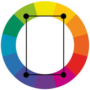
How to Incorporate Color Theory into Window Displays
The above pre-established guidelines for color schemes come in handy when creating window displays, especially once you understand the psychology that surrounds them. Depending on the objective of your window display and how you intend to use it to engage customers, you can select a specific combination that suits your needs. If your goal is to:
- Grab attention:
use complementary colors for a bold, high-impact look. Incorporating three (triadic) or four (tetradic) shades creates a similar stand-out appearance, while offering more versatility. - Unify unrelated items:
combine monochromatic shades to build a connection between otherwise unlike objects. - Create balance and harmony:
incorporate analogous colors for a coordinated look that pleases the eye. - Form a focal point:
when using analogous, triadic, and tetradic combinations, choose one dominant color as the center point and incorporate the others as supportive accents. This also helps prevent overstimulation. - Calm the mind:
using colors on the cool half of the wheel (like blue, purple, and magenta) tend to help people relax. - Elicit action:
using colors on the warm half of the wheel (like yellow, orange, and red) signal feelings of passion and excitement. - Establish timelessness and versatility:
use achromatic shades. They can also be combined with any color on the wheel to dial down intensity.
Psychology of Colors
It also helps to understand the psychology behind individual colors when choosing which shades you want in your chosen scheme. Each individual person may perceive the meanings of colors slightly differently based on culture and personal life experiences, but the psychology of colors is consistent. Let us explore the primary and secondary colors and what they mean:
Yellow: optimistic, playful, and happy. It can be associated with intelligence and clarity.
Blue: calm, cool, and confident. It signifies importance and stability and suppresses appetite.
Red: energetic, warm, and passionate. It elicits intense emotion ranging from anger to urgency to love.
Orange: encouraging, adventuristic, and social. It stimulates appetite.
Purple: royal, noble, and sentimental. It can be linked to spirituality and mystery.
Green: growth, renewal, and wealth. It often represents nature or money.
Once you have established an effective color scheme featuring what you consider the most appropriate shades based on psychology, the only thing left to do is bring the vision of your window display to life. Get creative with how you incorporate your specific palette into the display.
Consider turning to a display supplier that specializes in customization to easily work specific shades into hanging signs, staging materials, and backdrops. Utilize colored pedestals and risers to accentuate certain products or to create visually appealing accents. However you decide to execute, just be sure to allow your products and your messaging to hold center stage and not get overpowered by an overwhelming palette.
Melissa Stivale is a professional writer and content creator at shopPOPdisplays.com, a leading manufacturer of stock and custom retail merchandising point-of-purchase (POP) displays. Melissa is an experienced visual merchandiser and marketing strategist in the retail industry with expertise in fashion apparel, accessories, and consumer goods.

