 By Paul Russo
When it comes to having an impact at a trade show, booth design is a crucial part of the formula. While certain aspects of a booth, such as promotional items and handouts, are standard for any show, incorporating a unique design can make your booth stand out from the crowd, boost ROI and ensure success. By taking some of the elements from the following four innovative booth designs, retailers can be sure to attract trade show attendees to their own exhibits.
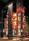
1. Formica Group at International Builders’ Show
Sometimes booth design is simply about standing out. The towering 35-foot tall booth (above left) by Formica Group at International Builders’ Show combined a chic and simple appearance with larger-than-life dimensions to create a booth that could be seen from virtually every corner of the showroom. By using their own product in display elements, such as tables and flooring, the booth became an interactive display of everything the company offers. Geometric arrangements of various elements provided flow within the large space to guide the attendees and prevent confusion. By keeping the presentation simple, Formica Group avoided making a display that was chaotic due to its large dimensions.
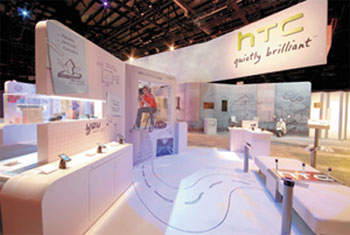
 2. HTC Corporation at International Cellular Telecommunications and Internet Association
HTC understands the importance of capturing the multiple demographics in your target audience. With their display at the CTIA show, they effectively created four different stories in a single booth. From the younger audience using their phones to stay in touch with friends to the corporate executive whose phone was a productivity center, each section of the booth was precisely targeting for maximum impact. The hand-drawn and predominantly visual booth lured show goers in from a distance and then offered a story that was sure to remain in their memories.
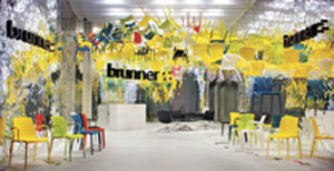
 3. Brunner GmbH at Salone Internazionale del Mobile
Sometimes a booth design is so unique that it becomes more than just a booth. With its floating chairs, mirrored interiors and artistic styling, this booth blew away attendees of the Salone Internazionale del Mobile. However, the design was much more than an attention grabber. By mirroring the interior of the booth, the design group created a sense of expansion within the booth. Clever use of steel wire created a floating and whimsical look to the chairs on display, and the high-contrast branding throughout the booth brought it all together. Each of these details added up to create a booth that captivated audiences to effectively promote Brunner.
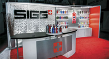
 4. Sigg USA Incorporated at Surf Expo
When properly designed, a trade show booth does not always need to tower above the competition, feature bright lights or sounds or use other common crowd attracting features. The Sigg USA booth is a prime example of how tying your product and message into your booth and mastering the presentation can make even the smallest booth the star of a trade show. Featuring only three colors and just as few materials, this booth emphasized the product and company with near artistic precision. The bold yet clean approach also fit the line of products to cohesively tie the booth, company, product and message together to great effect. Simple accent lighting and a minimalistic design allowed the product to remain the focal point of the booth while still attracting the attention of anyone passing by.
About the Author: Paul Russo has been writing about trade shows and table top displays for various trade show companies throughout his 10 year career. When not writing, you can find Paul relaxing at home or out training for his next triathlon.
