by Melissa Stivale
Every December since 1999, Pantone® — the expert, authority, and industry standard for color profiles — has announced its ‘Color of the Year’. It is the shade that represents the current cultural mood and once declared as the ‘It’ color, gets seamlessly incorporated into everything from fashion and product designs to home decor and events, and not without good reason. Of course, easy to unify across all platforms, it also keeps things fresh and relevant, as well as helps narrow down choice overload.

For 2022, the company chose ‘Very Peri’ (17-3938), a beautiful periwinkle, which blends blue with violet-red undertones. Unlike its predecessors, it is the first shade created entirely new for the honor instead of being selected from the expansive list of existing ones already making up the Pantone® Color System. The creation of the color reflects the way the world is experiencing unprecedented transformation spurred by the pandemic and innovation and the exciting possibilities of what is to come.
What Does the New Color Mean?
Executive Director of the Pantone® Color Institute, Leatrice Eiseman, eloquently describes Very Peri 17-3938 as displaying “a spritely joyous attitude and dynamic presence that encourages courageous creativity and imaginative expressions.” Blue is said to create feelings of calmness and peace and is often viewed as a reliable constant, and the violet-red undertones present in Very Peri add a sense of unexpected energy and vivaciousness that call for a fresh start.
Fashion-forward InStyle even goes as far as attributing periwinkle to helping manifestations come to fruition, suggesting it boosts confidence and motivation, while bringing about positive change. The specific shade is also meant to illustrate how digital colors are interpreted in the physical world and vice versa.
 Embracing the ‘It’ Shade for Your Personal Aesthetic
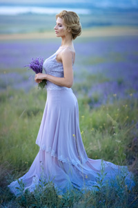
Whether it is in wedding and event planning, home design, or a wardrobe refresh, embracing periwinkle as THE shade of the moment only seems wise, as it reflects the current societal vibe and ensures relevance. Brides who have their fingers on the pulse of what is trending are already intending to use the color for their bridesmaids’ dresses, bouquets, and photo backdrops this year. Another choice is using customized acrylic boxes, risers, and even acrylic invitations in Very Peri as part of their celebrations and centerpieces. Ideally, it will create peacefulness through the stress of planning, while evoking excitement around the big day.
Fashion is an obvious way to foray into periwinkle as well. Designers look to mood-shaping authorities like Pantone® for cues when creating their palettes, which means the color is likely to show up on more runways and big box retailers as 2022 marches on. Periwinkle handbags and shoes add a fresh pop of color to beige and neutral outfits, while a periwinkle dress creates a fun statement without being overly bold.
How to Apply Very Peri in Business
When it comes to business and branding, the psychology of color is undoubtedly important, having an impact on how your company is perceived. In fact, when making snap judgments about a product, 60-90 percent of that subconscious process is purely centered around color (financesonline). So, it is certainly something to consider when creating your logo, advertisements, packaging, and displays. Where would Tiffany be without iconic Tiffany Blue1837?
Ever-savvy Microsoft® has already incorporated Very Peri into PowerPoint slide themes and Windows wallpapers, while brick-and mortar-retailers can benefit from using it in their seasonal and custom POP displays. A retail window featuring periwinkle has the potential to draw the customer in store, while an endcap display embracing the shade can make the brand seem relevant, dependable, and inviting. Creating memorable color- or brand-specific retail merchandisers in a variety of materials like acrylic and wood conveys a professional look for less. The process uses ultraviolet lights to cure ink as printed, creating the sharpest imagery every time. So, if you are thinking of refreshing marketing materials with Very Peri in mind for a competitive edge, look at customization options.
Complementary Colors
Unsure what shades will complement Very Peri in your displays? Pantone® created four carefully curated, playfully named palettes featuring the shade — each conveys a unique mood and simultaneously proves the color’s versatility.
 Balancing Act includes both warm and cool tones that are lively and inviting, including Elderberry 17-1605, Muted Clay 16-1330, and Dried Moss 14-0626.
 Wellspring focuses on Very Peri’s compatibility with earthy greens, namely Treetop 18-0135.
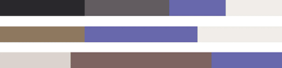 The Star of the Show allows Very Peri to add juxtaposition to soft neutrals, like White Sand 13-0002 and Deep Taupe 18-1312.
 Amusements is spontaneous and fun. As part of the range, Very Peri only adds to the whimsical boldness of shades like Pink Flambe 18-2133 and Tawny Orange 17-1341.
No matter how Veri Peri is incorporated into retail displays, one thing is clear: Pantone® knew what it wanted to accomplish with the creation of this optimistic and soothing color — engaging and uplifting consumers again after a dismal few years.
Melissa Stivale is a professional content creator for the retail manufacturing industry and a writer at shopPOPdisplays.com, a leading manufacturer of in-stock and customizable retail point-of-purchase (POP) displays and merchandise.